Mile High LEDs

Mile High LEDs

Southwest’s partnership with the Colorado Rockies came to life through a family of animated, extra-wide LED graphics displayed throughout Coors Field. Using the venue’s field-wall specifications and campaign messaging, I adapted the creative across multiple stadium displays. A vivid blue motion system and concise baseball-inspired copy helped the messaging remain clear and readable at stadium scale.

Bag Tracking

Bag Tracking

Real-time bag tracking gave customers a clearer way to follow checked luggage from the airport counter to their destination. I designed this campaign to introduce the new feature through simple visuals that connect physical baggage handling with digital status updates. The creative focuses on key moments in the journey, including tag printing, aircraft loading, and arrival. I used close-up luggage photography, ramp imagery, and clear progress graphics to make the process easy to understand at a glance. The final campaign presents the feature as a practical tool that gives travelers more visibility and confidence throughout their trip.

Unused Storyboard Idea

Southwest Wrapped

Southwest Wrapped

A personalized year-end recap turned each customer’s travel activity into a shareable, data-driven experience inspired by the format of Spotify Wrapped. I designed the email system to highlight each member’s total flights, Rapid Rewards points, redemption activity, status, and other unique milestones from the year. The campaign was built to scale across about 29 million recipients while still making every message feel personal. I used bold color blocking, modular content cards, expressive photography, and concise copy to keep a large amount of information easy to scan. The final design balanced celebration, loyalty recognition, and future travel prompts within one connected email journey.

Earth Month Sustainability Campaign

Earth Month Sustainability Campaign

Earth Month provided the foundation for an email campaign focused on sustainable travel and Southwest’s environmental commitments. I designed a connected series of modules that encouraged customers to offset carbon emissions, reduce waste, pack with intention, and use digital travel tools. The visual system combines rich green fields, close-up botanical textures, and expansive coastal photography to keep the message grounded in nature. I organized the content into clear sections with bold headlines, simple icons, and direct calls to action that support quick scanning. The final email balances educational content with a strong promotional offer while maintaining a consistent visual rhythm from top to bottom.

Heart for Hawaii

Heart for Hawaii

The Hawaii rally cry became a flexible identity system designed to bring the energy of the islands into one expressive lockup. I combined custom script lettering with a vibrant Southwest-inspired gradient and simplified floral and honu motifs. Coordinated full-color, blue, black, and reversed versions prepared the identity for consistent use across a range of campaign touchpoints.

On Ice, In Flight

On Ice, In Flight

A 18 foot square graphic welcomed fans into the arena by pairing Southwest aircraft imagery with the San Jose Sharks partnership. I built the composition around a clean ice-blue gradient, oversized aircraft photography, and a bold co-branded lockup, then prepared a venue preview to show how the artwork would appear at entrance scale. The final design creates an immediate game-day read while giving both partners equal visual presence.

Flight of the Raven

Flight of the Raven

Baltimore’s raven mascot takes center stage in this polished sports-partnership image composite, staged alongside a Southwest aircraft on the airport ramp. I combined the mascot and aircraft photography into one cohesive daylight scene, carefully balancing scale, perspective, edge detail, and color. The final composition helps the black-and-purple character treatment sit naturally within the runway environment while standing out against the vivid blue plane.

Hurry Up and Score

Hurry Up and Score

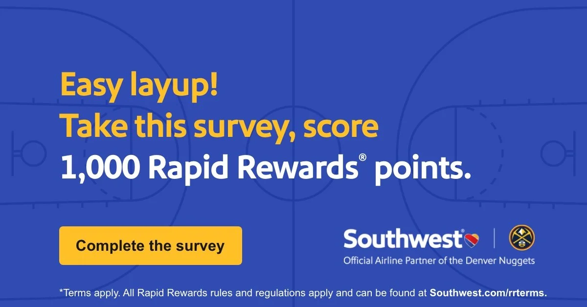
Basketball-inspired graphics gave Southwest’s Denver and Colorado Springs super sale a fast-paced visual identity. I carried the core basketball, painted-court, and high-contrast offer language across desktop and mobile homepage heroes, email placements, and a special-offer card. Each format adapted the content hierarchy and market messaging while maintaining a cohesive campaign system.

A Week of Takeoffs

A Week of Takeoffs

Seven distinct offers came together as one responsive landing-page banner system for Wanna Get Away Week. Spanning WOW fares, credit-card rewards, Rapid Rewards points, hotels, rental cars, vacations, and a generic sweepstakes message, the campaign maintained a consistent visual family across desktop and mobile. I adapted the imagery, color, iconography, offer hierarchy, and calls to action for each promotion while preserving a unified structure throughout.

Baseball Birthday Sale

Baseball Birthday Sale

Southwest’s Wanna Get Away Week sale reached two baseball audiences through a paired email-hero system created for the Colorado Rockies and San Diego Padres. I adapted the campaign’s paper-airplane and cloud language into a responsive 600-pixel format, integrating each partnership mark while preserving a shared visual structure. The offer, booking window, call to action, and legal copy remained clear and legible when scaled for mobile.

The Ninth Island

The Ninth Island

A multi-channel loyalty campaign invited Hawaii travelers to turn three interisland round trips into a future getaway to Las Vegas, known as the “ninth island.” Using the acquisition brief and approved offer language, I developed a flexible visual system across homepage, mobile, email, registration, WiFi, and social placements. The campaign paired an aspirational Vegas destination story with clear enrollment steps, strong promotional hierarchy, and the required legal details.

Pattern in Motion

Pattern in Motion

I developed a custom windbreaker concept that translates Southwest’s visual identity into an energetic, wearable pattern system. I built the repeating grid of geometric shapes and color accents, explored full-pattern and color-blocked front treatments, and prepared front-and-back technical layouts and garment mockups to show how the design would move across seams, sleeves, and production panels.

In-Flight Menu - Drinks, Links, Movies, and More

In-Flight Menu - Drinks, Links, Movies, and More

Southwest’s June 2023 seatback menu brought a detailed inflight brief into a clear four-panel printed experience for system-wide use. I refreshed the crew-member cover, reorganized complimentary and paid beverage information, and incorporated new product photography and payment details. The final layout balanced dense connectivity, legal, and service content within a hierarchy designed for quick reading onboard.

Hawaii Awaits

Hawaii Awaits

Spring travel to Hawaii took center stage in a coordinated digital campaign spanning Southwest’s homepage, email, mobile, special-offer, and Rapid Rewards placements. Guided by the campaign brief and final 30%-off fare message, I adapted an airy, destination-led visual system across each format. Aspirational island imagery, clear promotional hierarchy, and concise calls to action helped the campaign remain consistent across every touchpoint.

Here’s the Pitch

Here’s the Pitch

A responsive family of digital banners extended Southwest’s San Diego Padres partnership across desktop and mobile placements. Using the internal design brief and final campaign copy, I translated the baseball-focused message into a flexible system built around deep blue, bright gold, and Southwest’s signature accent stripe. The layouts were adapted to keep the partnership message clear and consistent across compact mobile units and large-format display ads.
San Diego, Go, Go!

San Diego, Go, Go!

Southwest’s partnership with the San Diego Padres came to life through a family of animated, extra-wide LED graphics displayed throughout Petco Park. Using the venue’s field-wall specifications and campaign messaging, I adapted the creative for the first-base, third-base, and right-field displays. A vivid blue motion system and concise baseball-inspired copy helped the messaging remain clear and readable at stadium scale.

Triple the Holiday Rewards

Triple the Holiday Rewards

For this Existing Card Member holiday campaign, I designed a flexible digital experience that encouraged Southwest Rapid Rewards Credit Cardmembers to finish the year strong by earning 3X total points on eligible purchases.

I developed the visual system across the email hero, email split, registration page, app and mobile placements, homepage promotion, booking banners, and My Account touchpoints. My goal was to give the offer a polished seasonal energy while keeping the card imagery, registration message, and Companion Pass benefit clear across every format.

Shown above is the finished campaign system, built to feel cohesive at every customer touchpoint while supporting Southwest and Chase business goals.

Valentine's Partner Promotion

Valentine's Partner Promotion

As a partner Valentine's Day campaign, I designed a promotional email for Southwest Airlines that brought together a collection of offers to help Customers celebrate the holiday while earning Rapid Rewards points.

This project required balancing multiple partner brands, including 1-800-Flowers, Laithwaites Wine, and Rapid Rewards Dining, while maintaining Southwest's visual identity throughout the experience. My goal was to create a layout that was easy to navigate, visually engaging, and encouraged Customers to explore each offer as well as discover additional promotions online.
Shown above is the final email design, featuring each partner promotion within a cohesive campaign that aligned with Southwest's brand standards while supporting both partner and business objectives.
DC Nonstop Travel

DC Nonstop Travel

Nonstop travel from Reagan National Airport became the focus of a social campaign built to make destination options feel clear, useful, and easy to book. I developed a bold visual system around mobile booking imagery, aircraft photography, and concise messaging tailored for fast-moving social feeds. The campaign highlights routes from DCA while reinforcing the convenience and flexibility of flying Southwest. I used strong blue fields, oversized typography, and close-up compositions to keep each asset direct and easy to scan. The final set balances product-focused visuals with brand-led storytelling across both static and carousel placements.