Coffee at Cruising Altitude

Coffee at Cruising Altitude

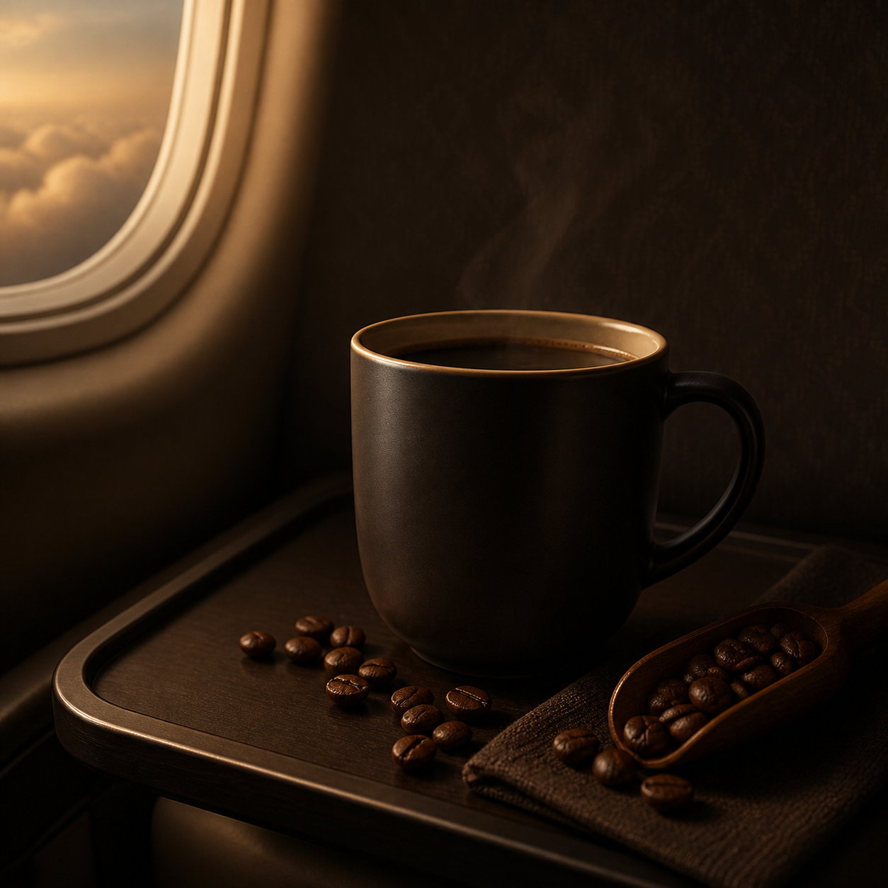
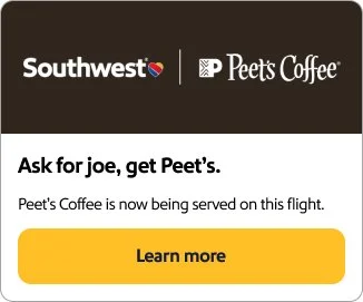
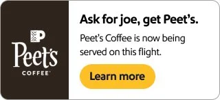
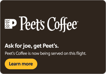
The launch of Peet’s Coffee onboard Southwest created an opportunity to connect a familiar cabin ritual with a warm, premium visual system. Rich coffee tones, product-focused imagery, and refreshed cabin details extended across in-flight placements, app and mobile modules, homepage assets, tray-table concepts, and printed napkin explorations. The work developed and adapted this partnership across physical and digital touchpoints, keeping the experience inviting, cohesive, and grounded in the onboard moment.
Rewards in Full Bloom

Rewards in Full Bloom

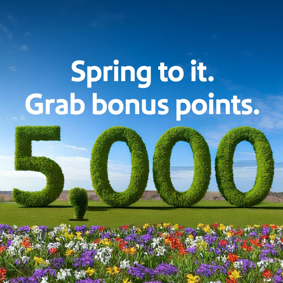
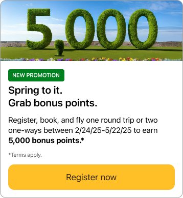
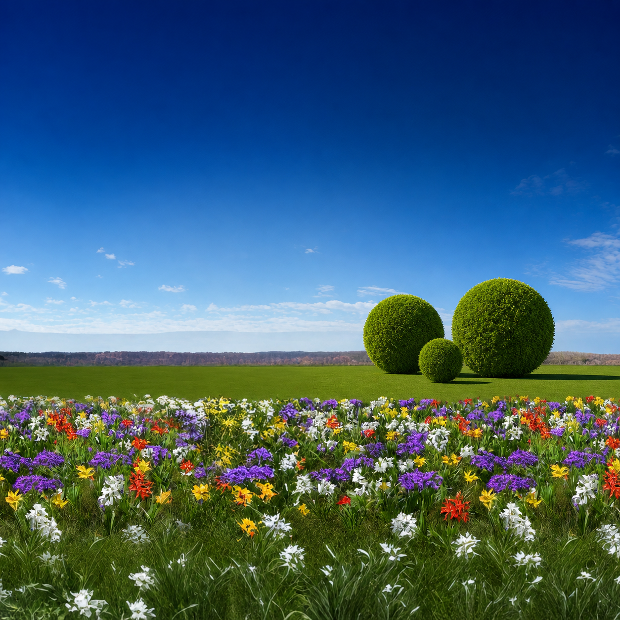
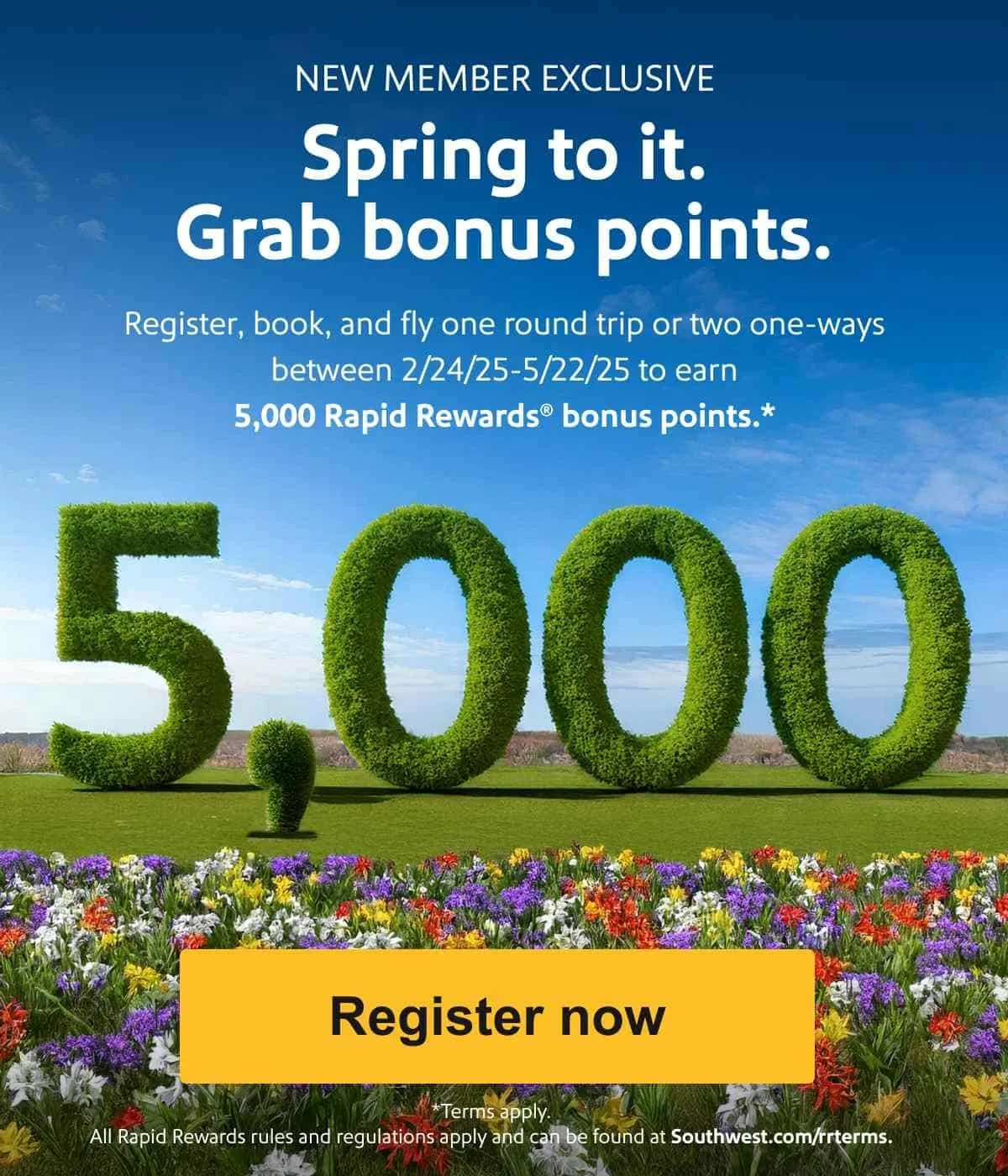
A second new-member Rapid Rewards campaign welcomed travelers with a 6,000-point incentive expressed through a bright, garden-inspired visual world. Sculpted topiary, colorful flowers, and open-sky imagery brought a fresh sense of growth to email, homepage, mobile, app, special-offer, and landing-page placements. The campaign was developed and adapted across each touchpoint to make the reward feel generous, approachable, and consistent throughout the onboarding journey.

A Summer Sale in Full Spark

A Summer Sale in Full Spark

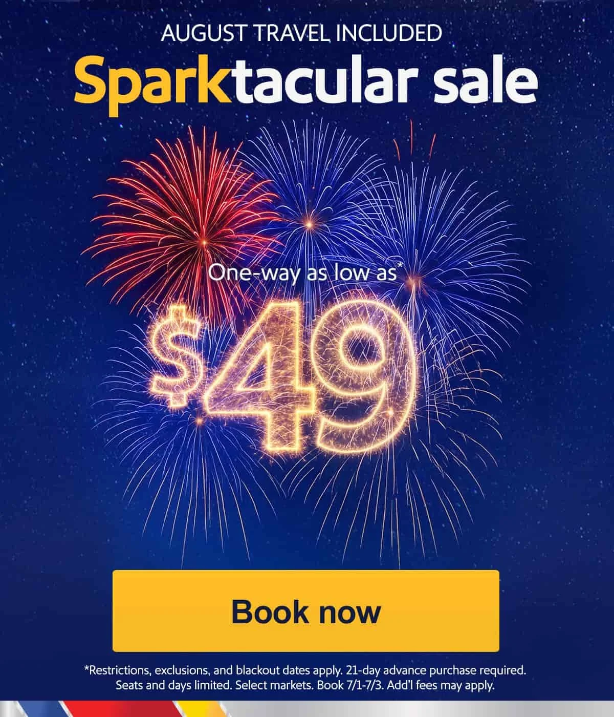
A July fare sale turned the energy of summer celebration into a coordinated campaign across Southwest’s owned channels. Firework-inspired type, deep nighttime blues, and bright red-and-gold sparks carried the offer through homepage, email, mobile, app, special-offer, and booking-path placements. The visual system was developed and adapted across each format, preserving the celebratory impact while keeping fare information and calls to action clear.

Denver Rewards, Ready for Takeoff

Denver Rewards, Ready for Takeoff

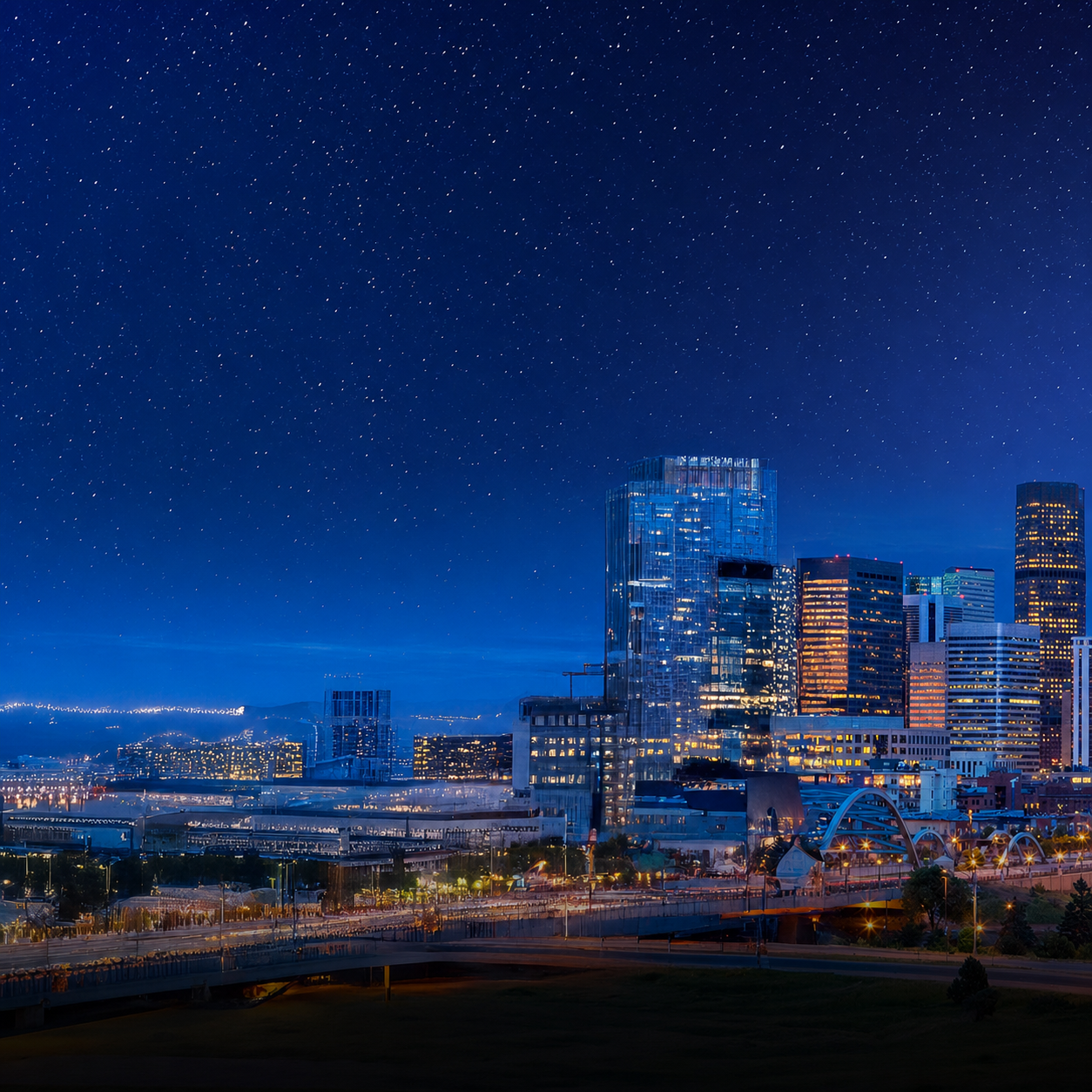
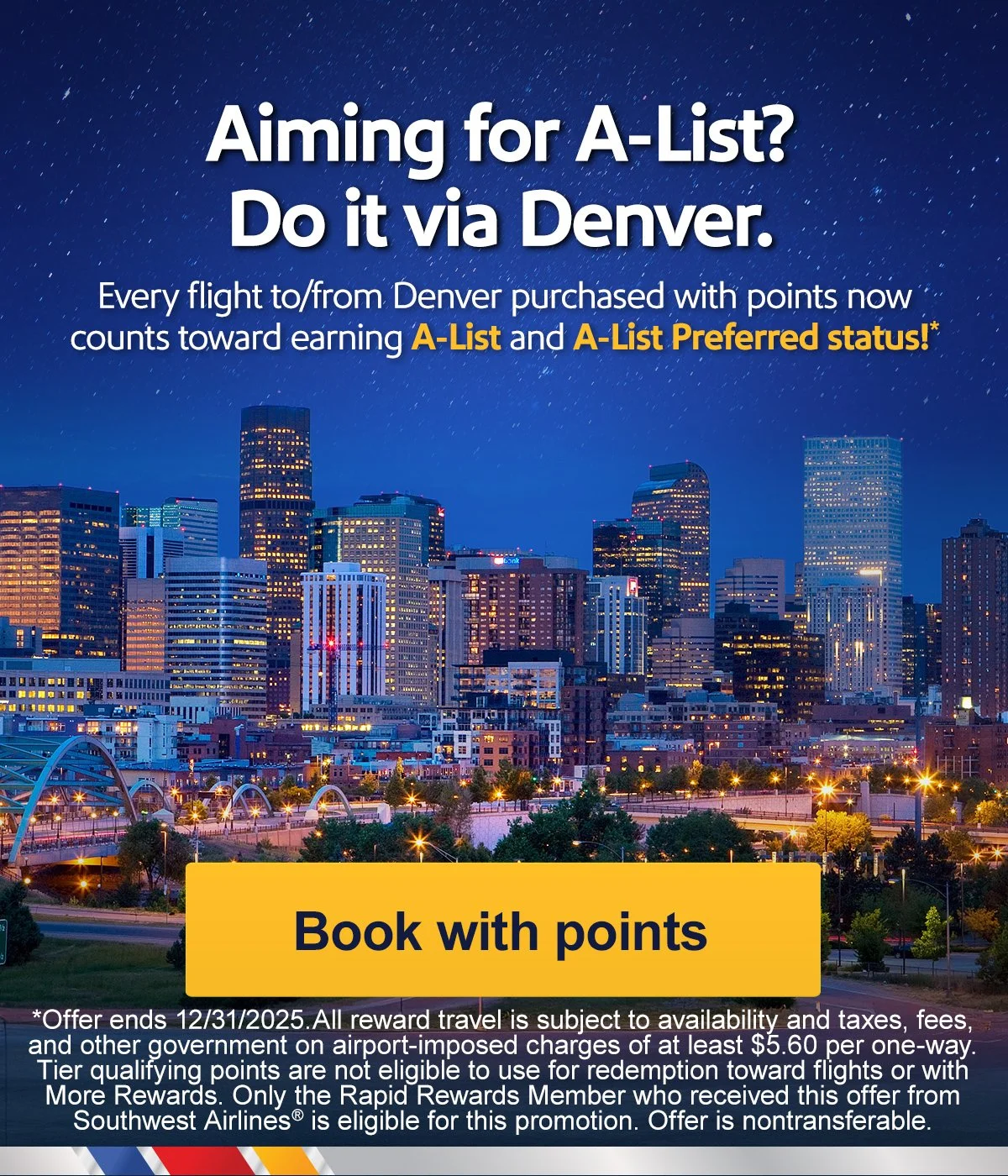
A Denver-focused rewards campaign invited local travelers to turn their Rapid Rewards balance into their next flight. The visual system brought together Colorado travel imagery, clear booking guidance, and a consistent sense of momentum across email, mobile, app, account-summary, homepage, and special-offer placements. The campaign was developed and adapted across these touchpoints to make rewards travel feel immediate, accessible, and connected to the Denver market.

A Mountain of Companion Pass Progress

A Mountain of Companion Pass Progress

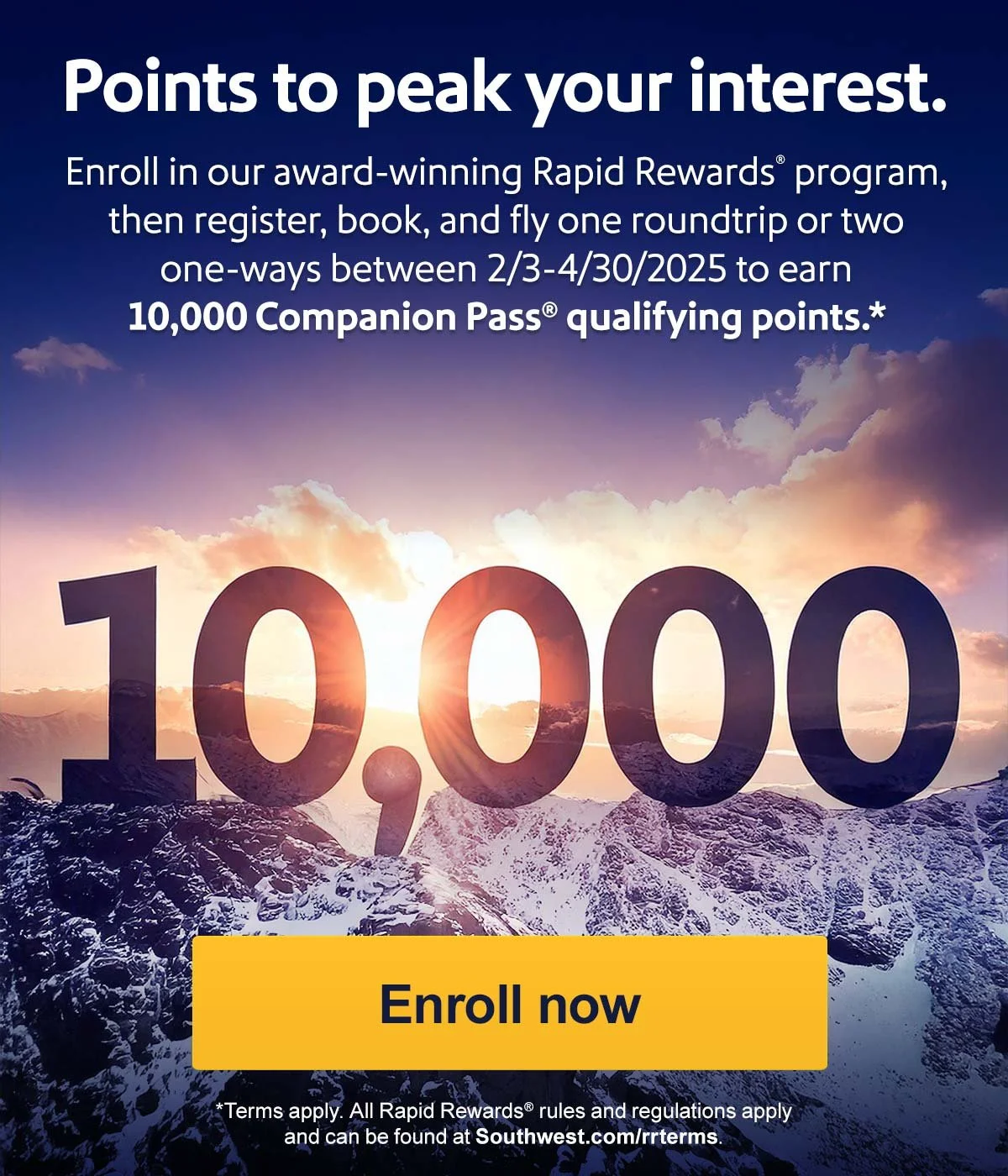
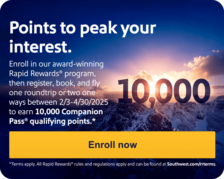
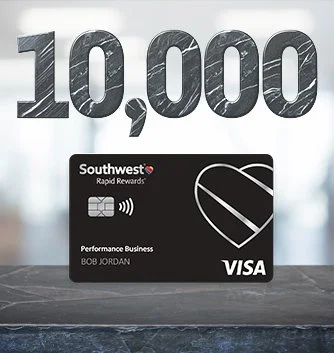
A Denver-focused bonus campaign transformed 10,000 Companion Pass Qualifying Points into a bold visual destination. Snow-covered Rocky Mountain imagery and sculptural dimensional details carried the offer across email, homepage, mobile, app, special-offer, and registration placements. The campaign system was developed and adapted across each touchpoint, preserving the scale and clarity of the offer while connecting Companion Pass progress to the character of Colorado travel.

A New Way to Pay Southwest

A New Way to Pay Southwest

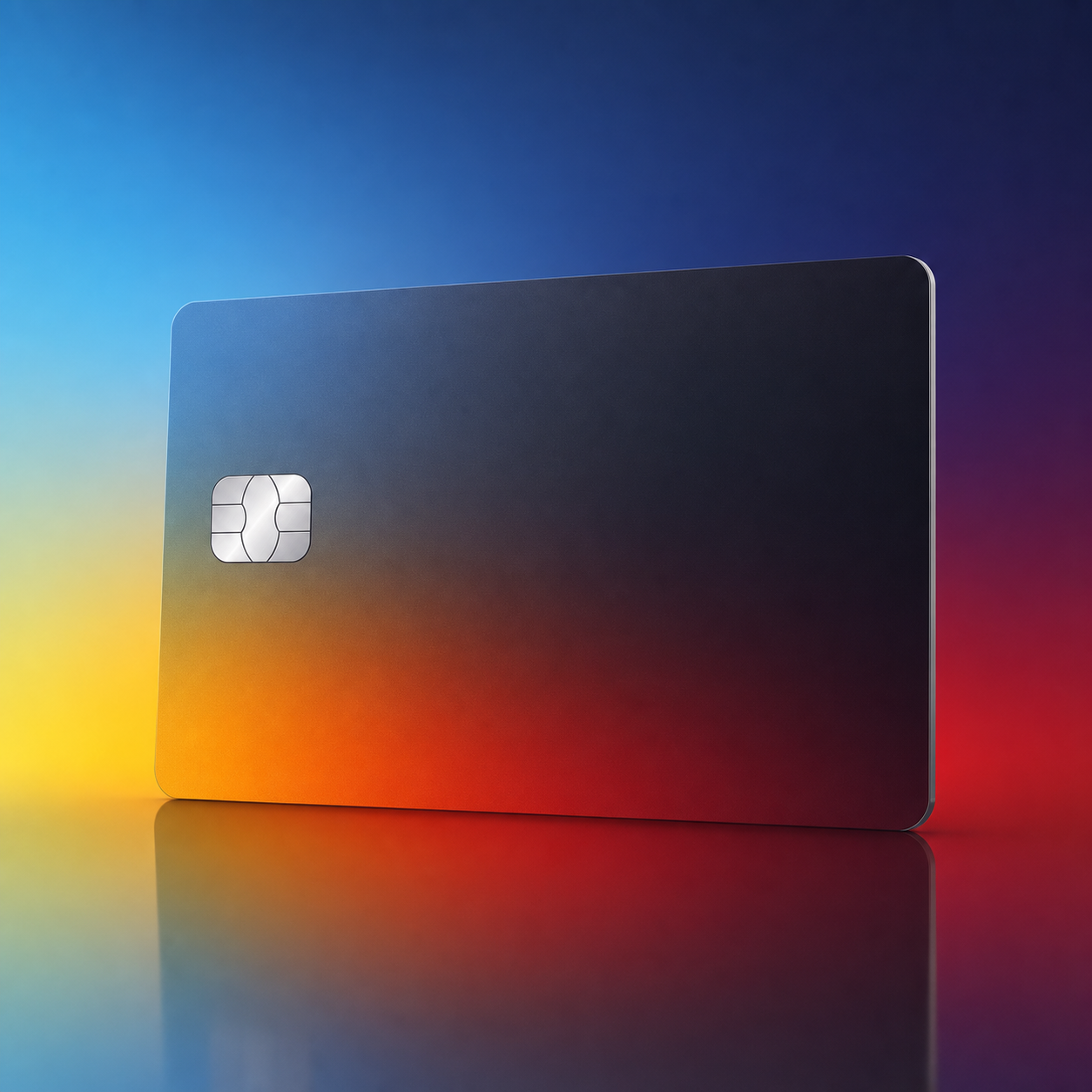
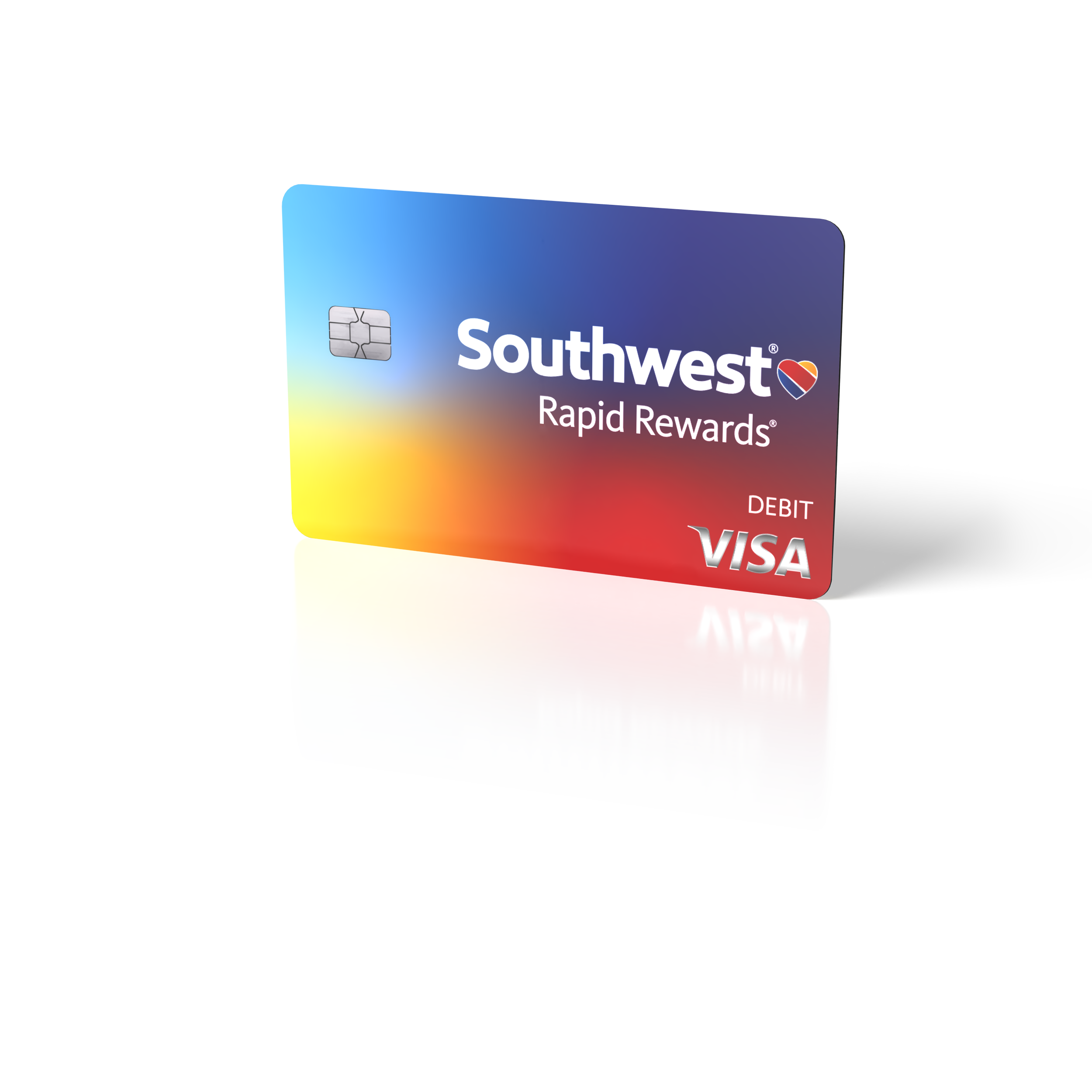
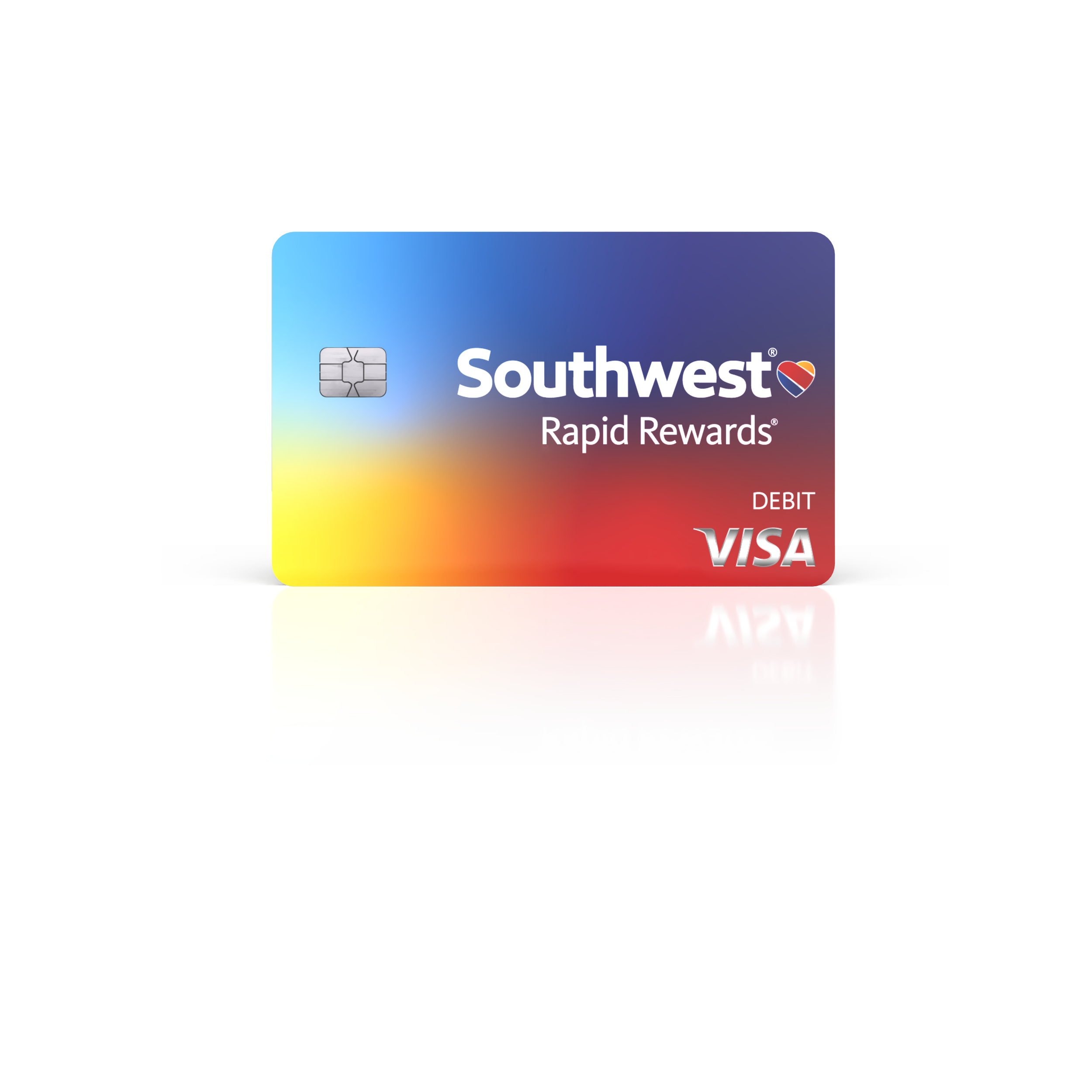
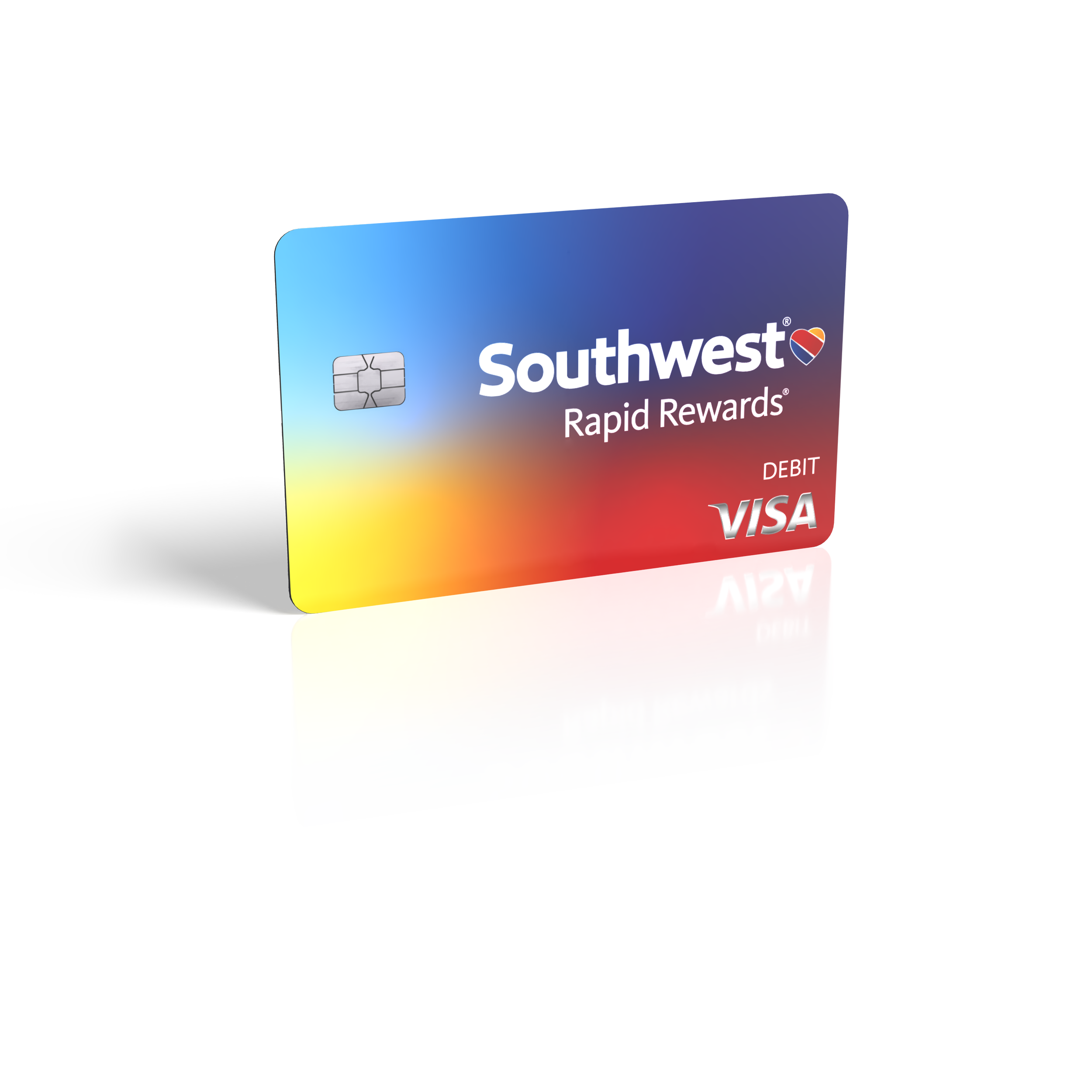
The Southwest Debit Card came to life through a focused series of product visualizations created to establish its physical presence before launch. I modeled, textured, lit, and rendered the card in Adobe Dimension, producing front-facing and three-quarter views that highlighted the card’s materials, edge detail, and dimensional form. The final images created a flexible set of polished assets ready for campaign, product, and presentation use.

Rewards, Built Into Rent

Rewards, Built Into Rent

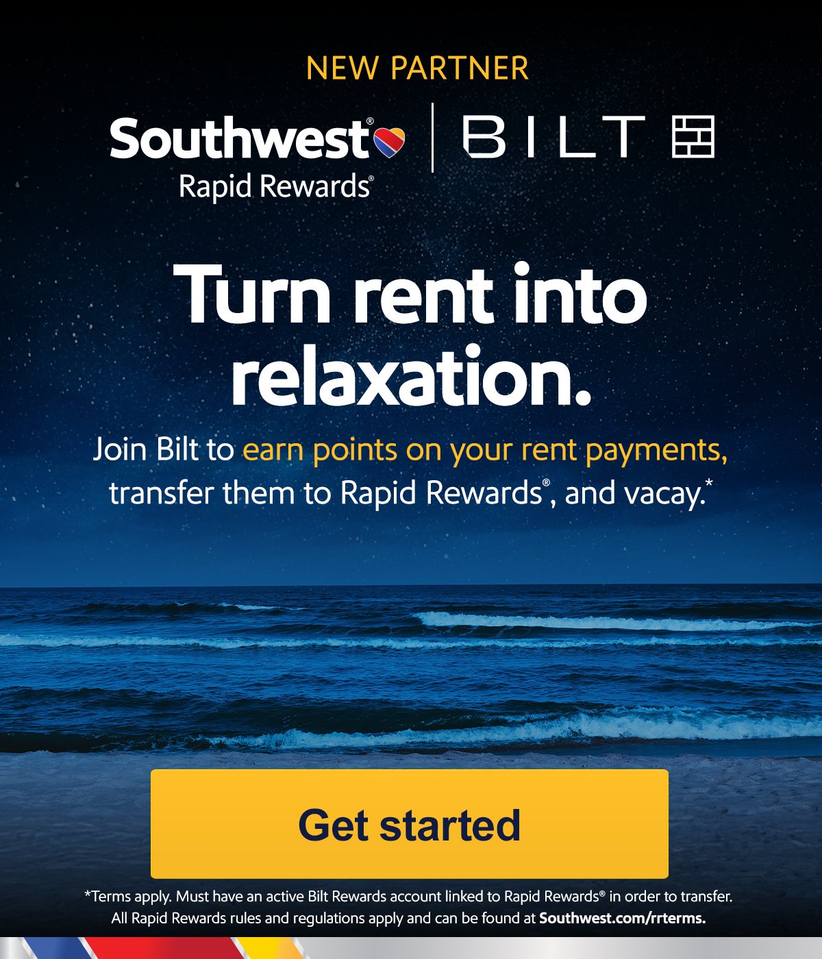
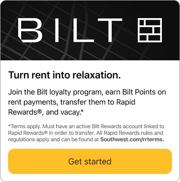
A new partner launch connected everyday rent payments with the possibility of future travel through a coordinated set of Southwest digital placements. The campaign extended across email, homepage, mobile, special-offer, and Rapid Rewards touchpoints, pairing polished lifestyle imagery with a clear explanation of the new earning opportunity. The visual system was developed and adapted across each format to keep the partnership cohesive, approachable, and easy to understand.

Rewards, Set in Stone

Rewards, Set in Stone

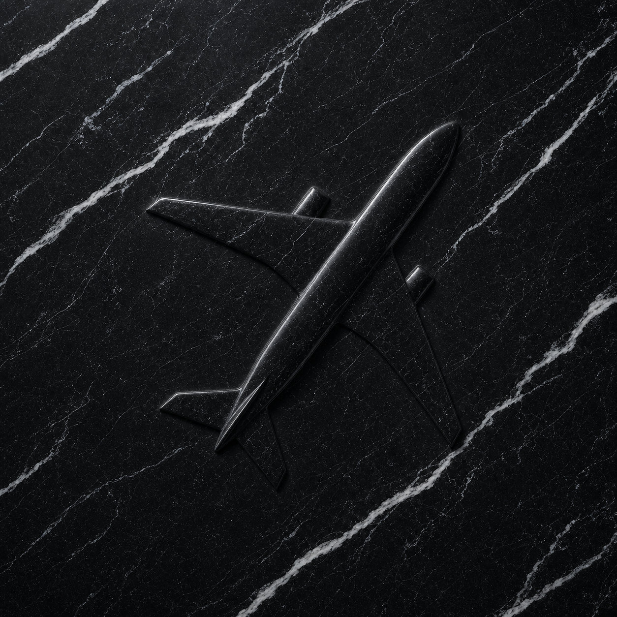
A premium spend-and-get campaign transformed two elevated point offers into a coordinated experience across Southwest’s digital ecosystem. The visual system paired sculptural black-marble numerals with clean white space and the Southwest Rapid Rewards® Credit Card, creating a distinctive look for 6,000- and 10,000-point messages across landing pages, email placements, mobile and app modules, special offers, and booking-path banners. I developed and adapted the campaign artwork across these formats, maintaining a consistent hierarchy and material treatment while tailoring each execution to its placement.
Guiding the Journey at DEN

Guiding the Journey at DEN

A large-format wayfinding system updated the Denver airport experience across priority check-in and TSA PreCheck® Touchless ID bag-drop zones. I adapted Southwest’s core ribbon language, deep blue palette, and clear instructional hierarchy to unusually wide architectural canvases, balancing brand presence with the practical information travelers need at a glance. The final backwalls create a cohesive journey across distinct service areas while remaining legible at terminal scale.

Game Day, Across Every Screen

Game Day, Across Every Screen

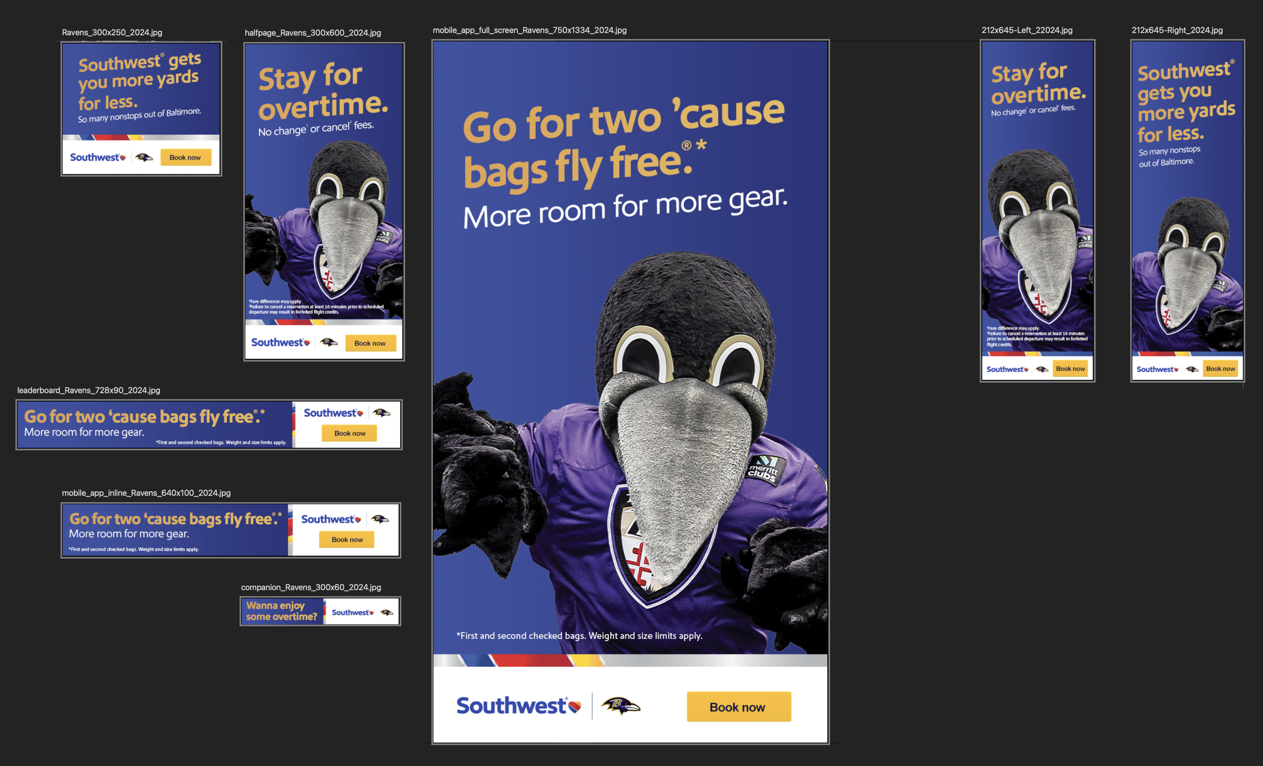
A full digital takeover brought Southwest energy into the Baltimore Ravens game-day ecosystem across web, mobile, email, video-player, and concourse placements. I developed the 2024 static asset family around dramatic purple environments, sharp black-feather motion, and bright red-and-yellow brand accents, adapting the system to everything from narrow leaderboards to full-screen mobile formats. The result stays cohesive across radically different dimensions while preserving the intensity of the venue experience.

More Ways to Make the Trip

More Ways to Make the Trip

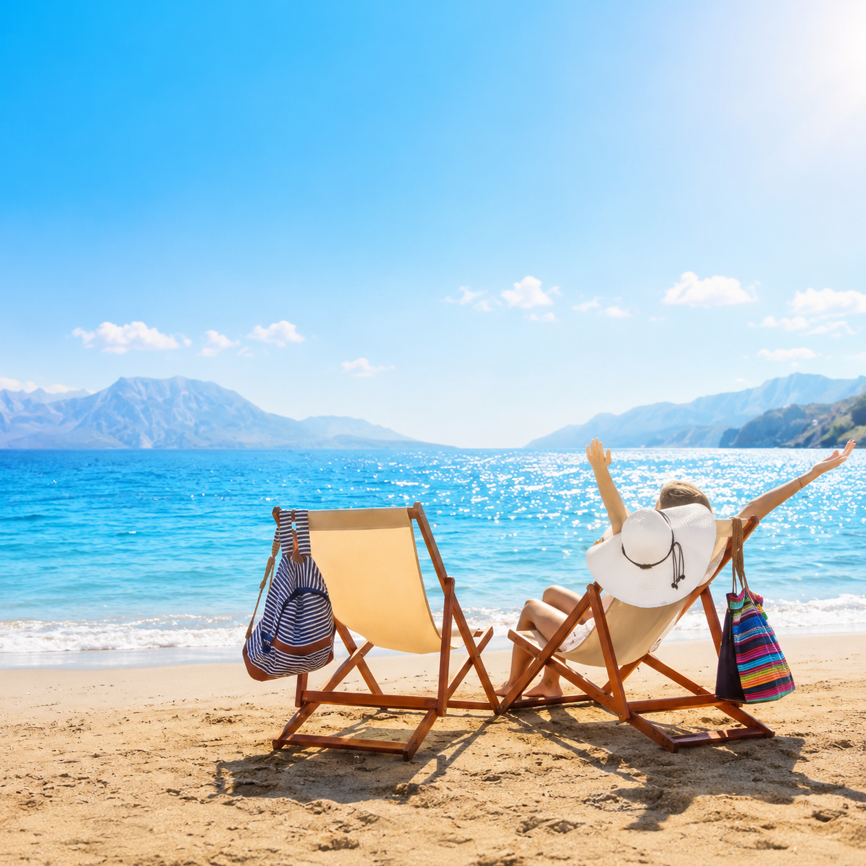
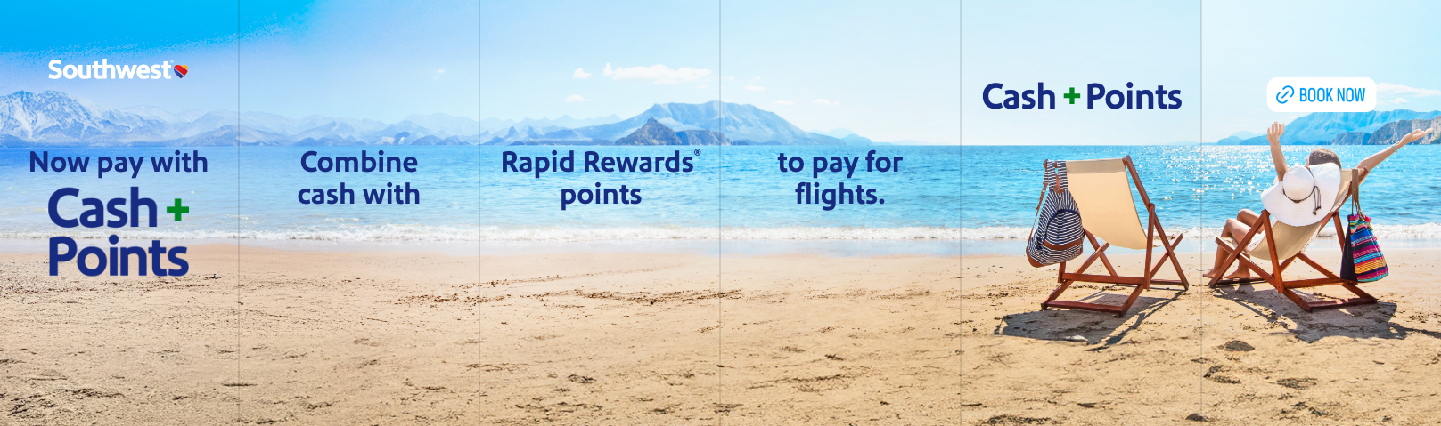
A flexible booking campaign showed travelers how cash and Rapid Rewards points can work together to bring more trips within reach. I built the relaunch system across social story, app, email, homepage, mobile web, booking flow, and landing-page placements, using clear step-by-step moments and destination imagery to make the feature easy to understand. The visual language balances education with aspiration so the mechanics never overshadow the reason to travel.

Points Within Reach

Points Within Reach

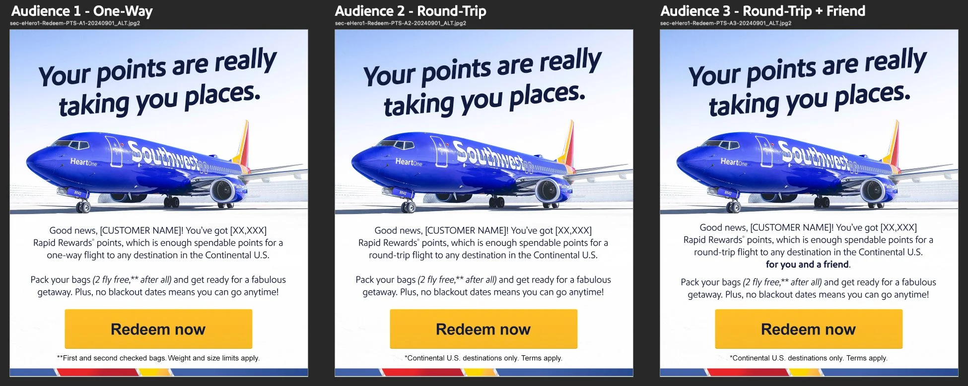
A redemption campaign reframed reward travel as something close, concrete, and ready to use. I developed the concept across hero, booking-path, mobile-web, and special-offer placements, combining destination-led photography with a simple visual hierarchy that helps members recognize when their points can unlock a flight. The modular creative supports multiple message variants while keeping the path from balance to booking straightforward.
A Faster Climb to Status

A Faster Climb to Status

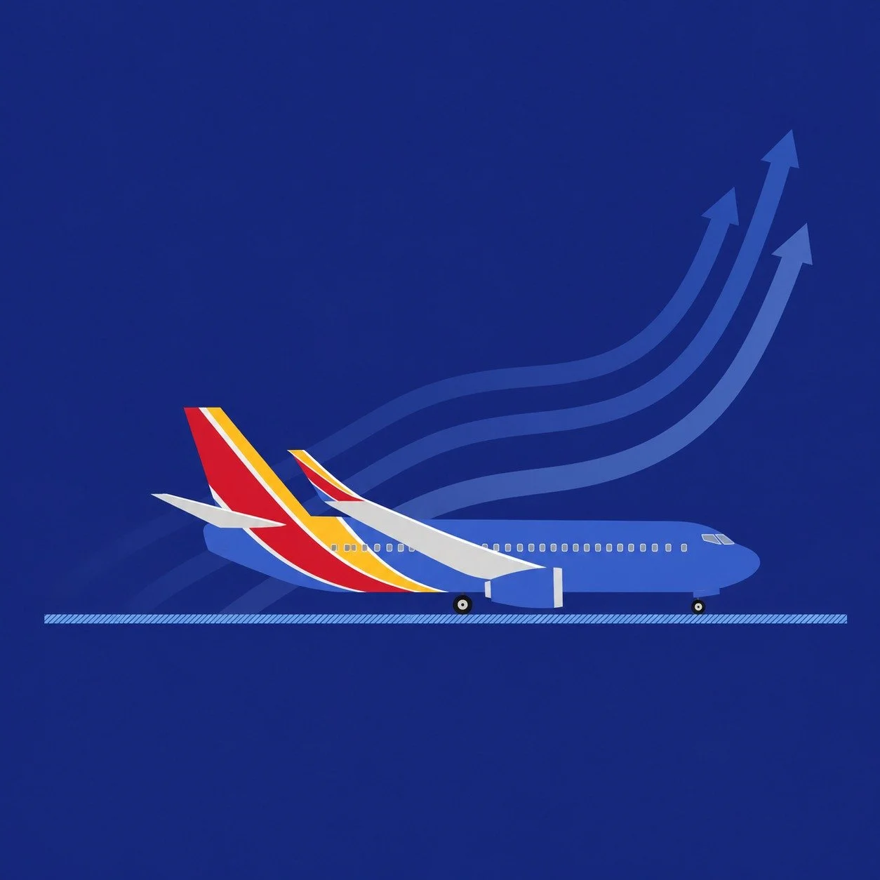
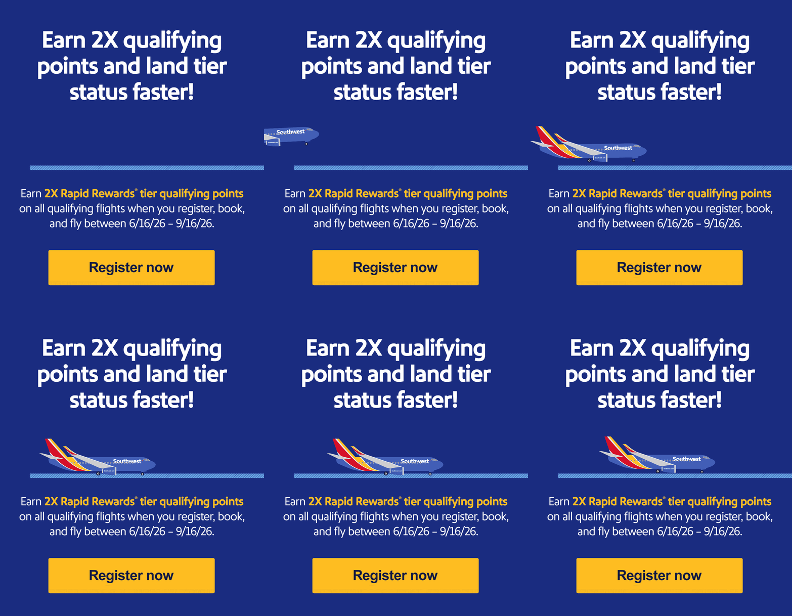
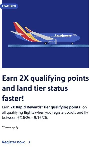
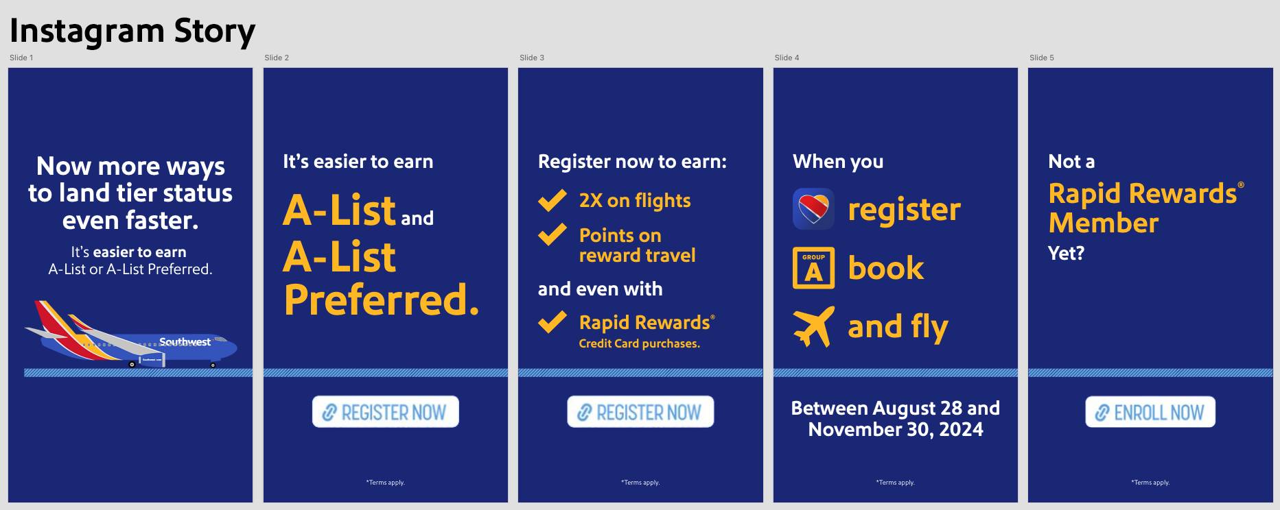
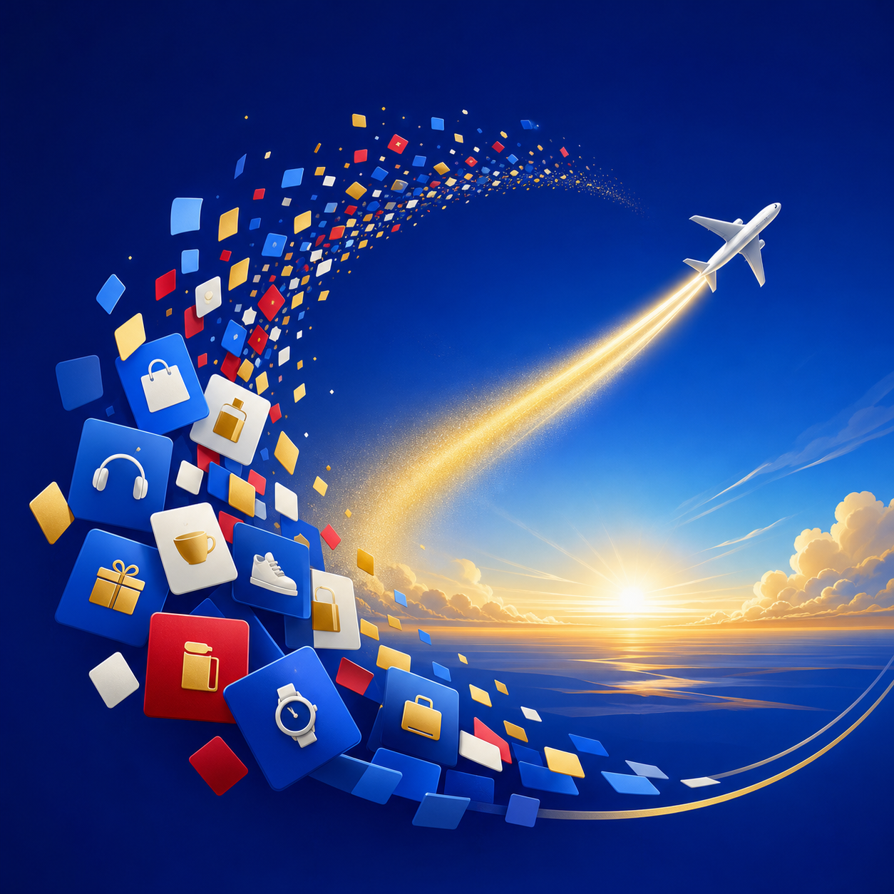
A loyalty campaign translated accelerated status into a clear visual journey from enrollment to elevated benefits. I built the creative system across social story, email, homepage, mobile web, in-app, special-offer, and internal communications, using ascending aircraft imagery, layered blue environments, and bold progress cues to make the promotion feel both attainable and premium. Each placement adapts the same momentum-driven idea to its own format without losing campaign continuity.

From Everyday Spend to Takeoff

From Everyday Spend to Takeoff

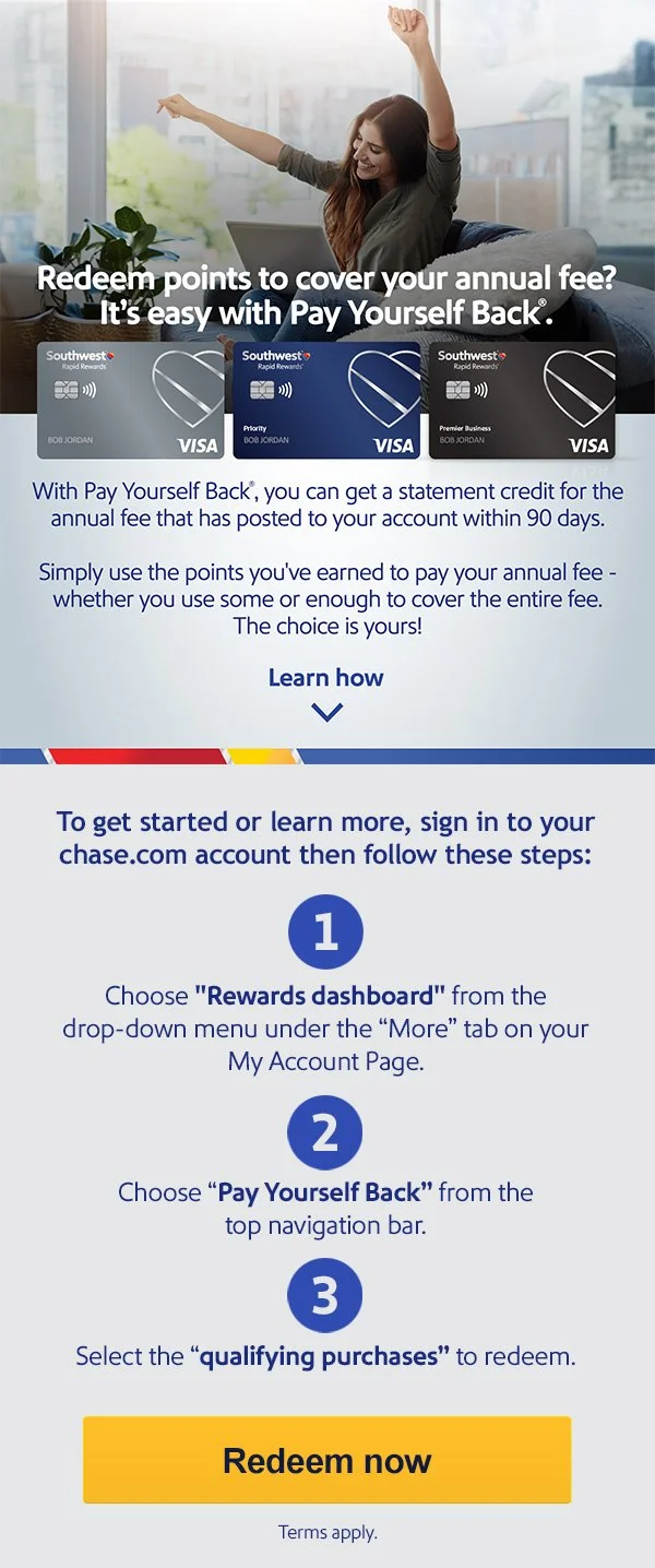
A rewards education campaign made an unfamiliar card benefit feel practical, clear, and immediately useful. I developed the creative across editorial, email, mobile web, special-offer, and navigation placements, pairing approachable lifestyle imagery with a focused visual hierarchy that explains how eligible purchases can offset an annual fee. The modular system keeps the benefit story consistent from broad awareness through detailed account guidance.

Wanna Go Wednesdays

Wanna Go Wednesdays

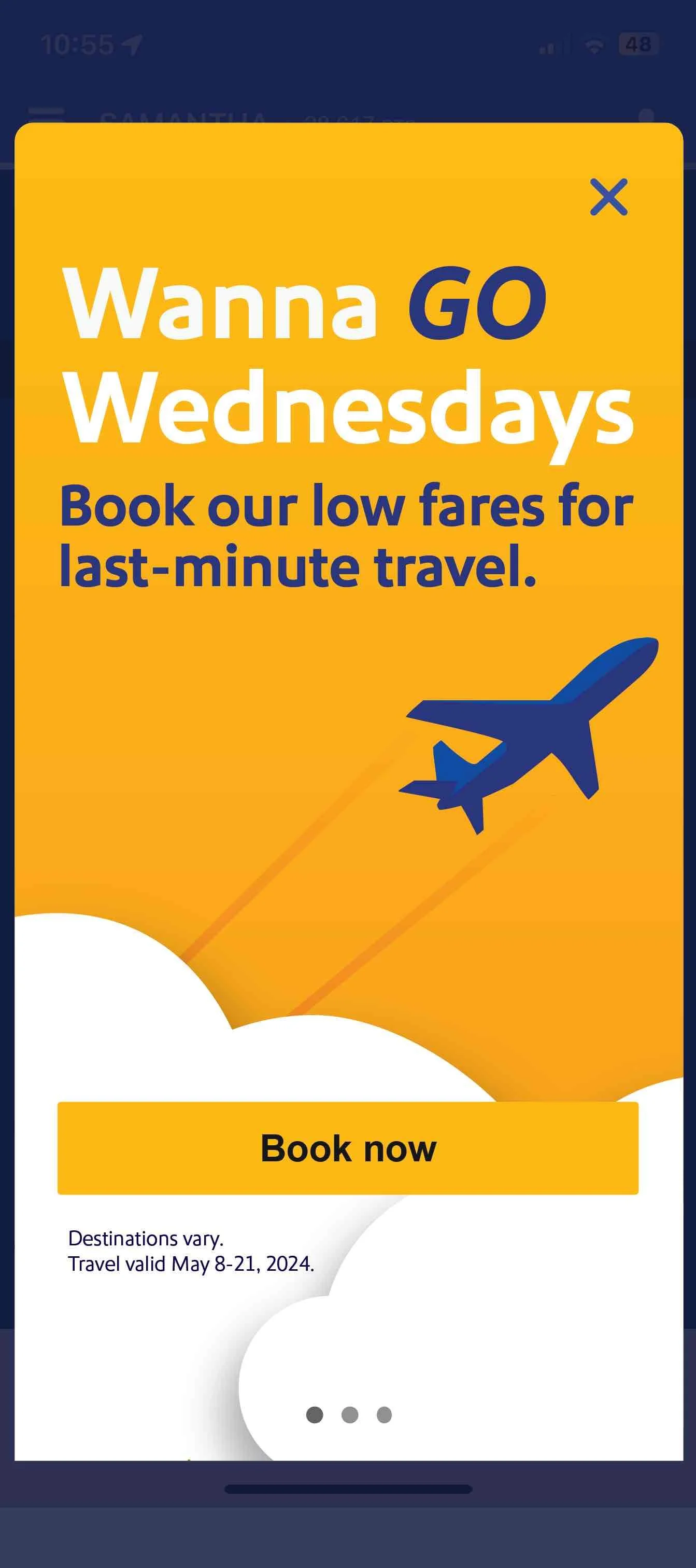
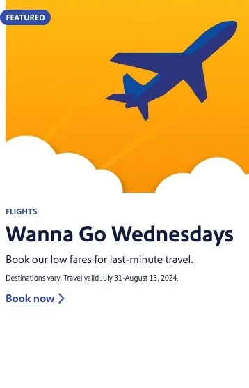
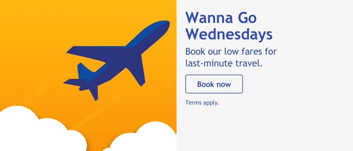
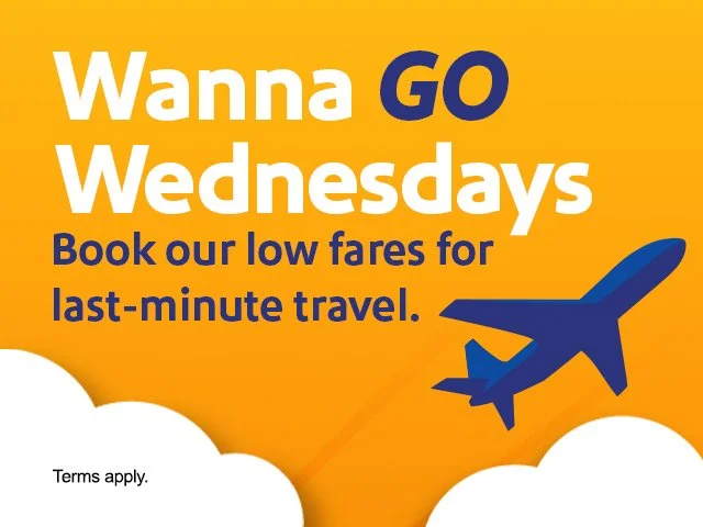
A recurring midweek fare campaign turned distressed inventory into an upbeat reason to start planning the next trip. I built the visual system across homepage, landing-page, mobile, email, and in-app placements, using bright destination photography, energetic blue fields, and modular promotional layouts that could flex week after week. The result feels immediate and optimistic while keeping each offer easy to scan across a wide range of digital touchpoints.

Across the Pacific, In Print

Across the Pacific, In Print

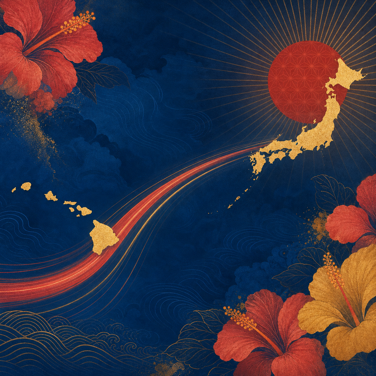
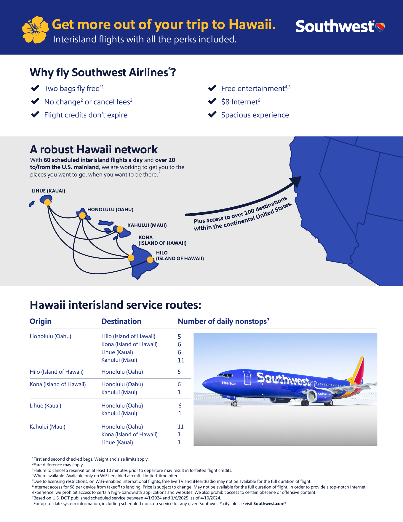
A bilingual sales one-sheet connected Hawaii and Japan through a clear, travel-forward print system built for international audiences. I shaped the page around bold route graphics, warm island color, and an approachable hierarchy that organizes nonstop access, traveler benefits, and destination information without losing the energy of the Southwest brand. The final collateral was prepared in English and Japanese, balancing practical detail with a welcoming sense of movement across the Pacific.

Two Airports, One Chicago

Two Airports, One Chicago

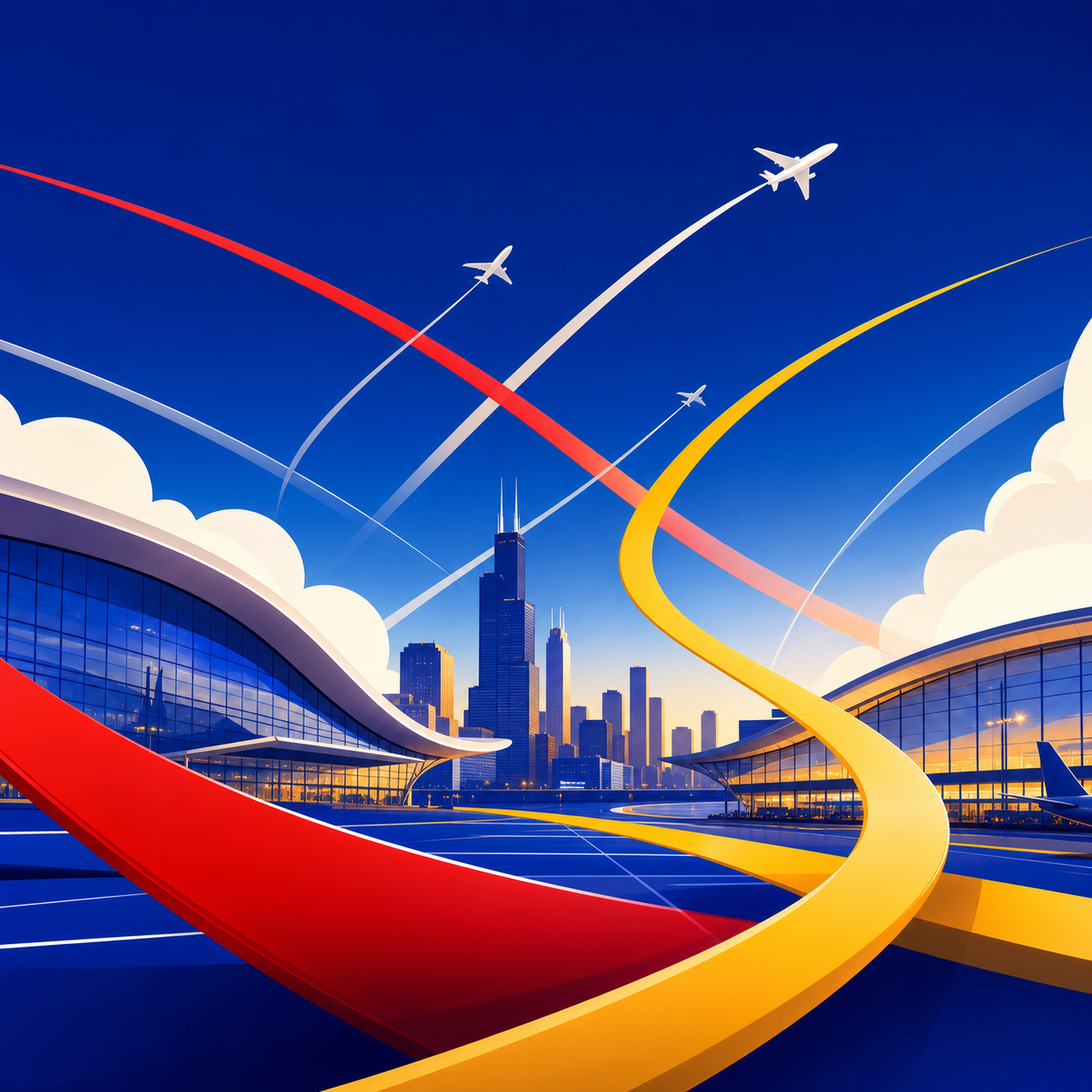
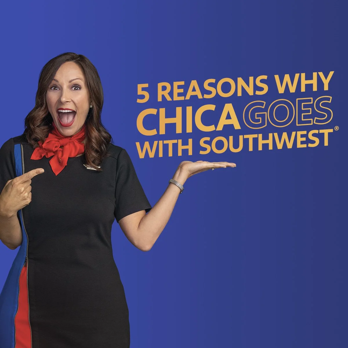
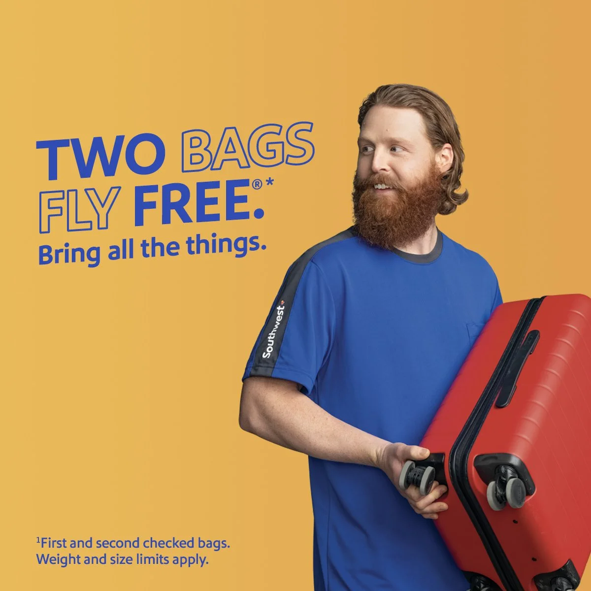
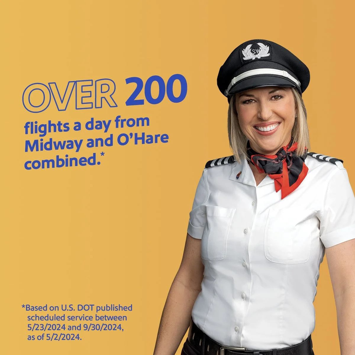
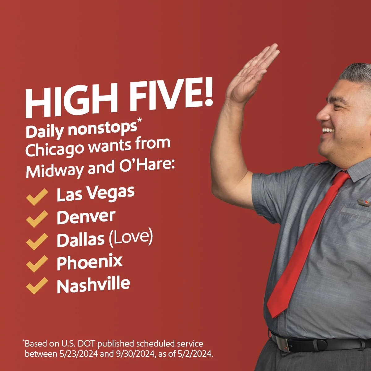
A citywide capacity-development campaign made flexibility the headline by showing Chicago travelers how Southwest connects them through both Midway and O’Hare. I developed the visual system across social carousel, linked ads, out-of-home, and motion, pairing bold blue fields with playful Chicago-first copy, destination imagery, and crisp red-and-yellow brand accents. The final work turns practical benefits—two airport choices, popular daily nonstops, free checked bags, and flexible travel policies—into a bright, fast-moving invitation to book.

Dash off to Denver

Dash off to Denver

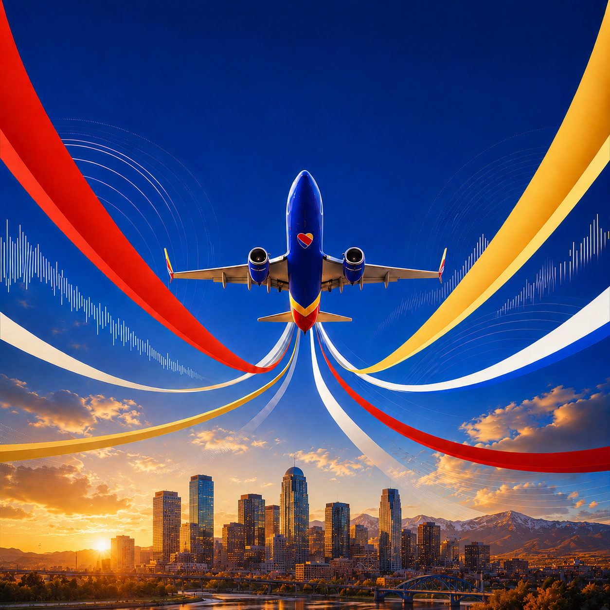
A Nashville capacity-development campaign turned the city’s nonstop network into an invitation for a fresh change of scenery. I developed the motion and supporting digital system across programmatic video, social carousel, linked ads, and out-of-home formats, combining energetic destination imagery with bold blue fields and direct, travel-forward messaging. Each execution keeps the route story moving while adapting cleanly to horizontal, square, and vertical placements.

Power Play in Motion

Power Play in Motion

A fast-moving family of arena animations brought Southwest messaging into the San Jose Sharks game-day environment across L-wrap and full-fascia displays. I built the motion system around vivid blue fields, sweeping red-and-yellow brand ribbons, aircraft imagery, and hockey-inspired copy such as low-fare frenzy, power play, and hat trick. Each composition was adapted to the venue’s unusually wide screen formats so the campaign remained bold, legible, and energetic from anywhere in the arena.

Mile High LEDs

Mile High LEDs

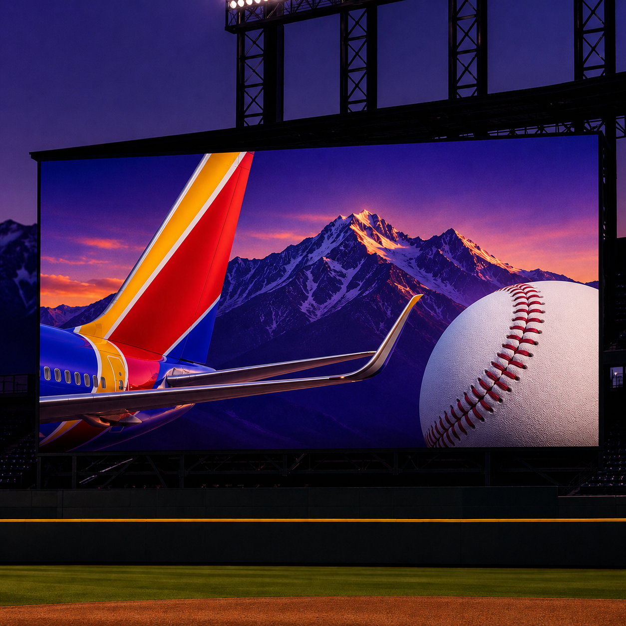
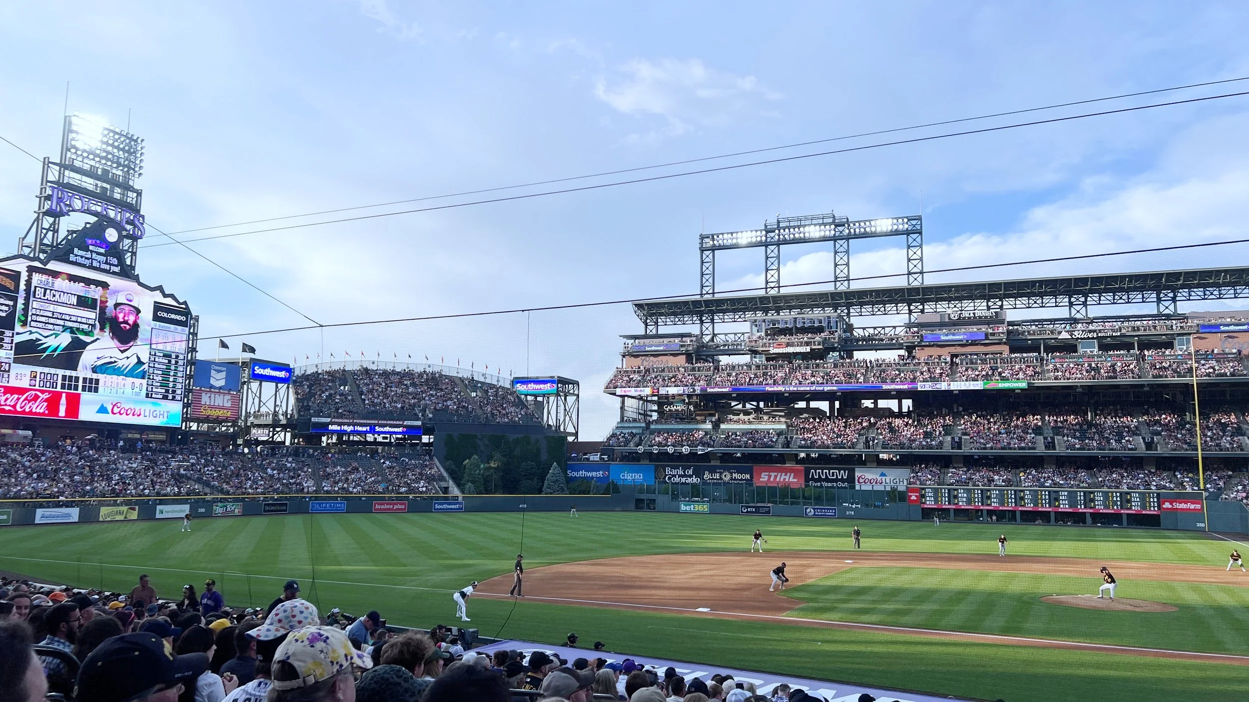
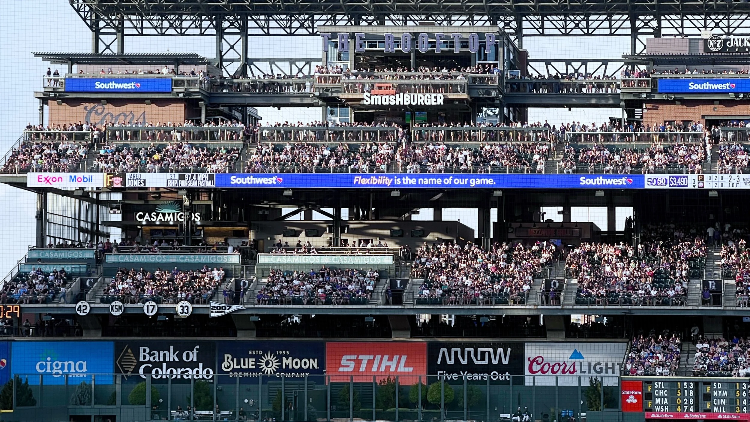
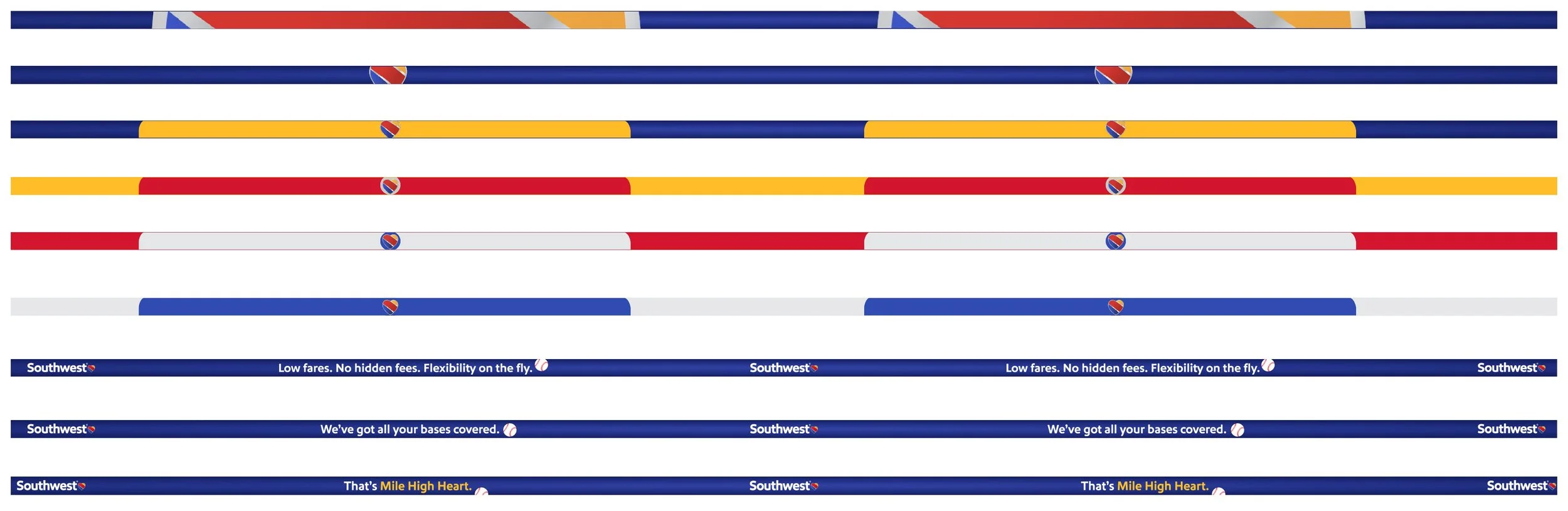
Southwest’s partnership with the Colorado Rockies came to life through a family of animated, extra-wide LED graphics displayed throughout Coors Field. Using the venue’s field-wall specifications and campaign messaging, I adapted the creative across multiple stadium displays. A vivid blue motion system and concise baseball-inspired copy helped the messaging remain clear and readable at stadium scale.